

I hope this blog gives you a new perspective. For the past 20 years, there has been an immense influence on American interiors to wash a room with tones of gray. We seem to follow the leader, and once the trend starts, we follow. This is one of those trends that has been very strong. Some trends are difficult to resist, this is one.
Many times, I have noticed that an architect will choose all colors of gray for the interior. Gray is a standard “Go to,” as they say, color for just about anything. One thing that influences this is that grayis difficult to make a mistake in matching colors. If one chooses blue and combines it with a blue that has green in it and you are working with a purple blue, you see immediately they clash. There’s something about how easily they clash and are uncomfortable together.
But I’ve noticed that most gray tones with blue live well with a green gray in the same space. And it’s unusual for it to be a problem. So, in this case most grays are compatible. I believe this because it seldom fails combining many grays, it has been an easy choice. People are successful, choosing gray colors without knowing how well they really relate to each other. Happily, an amateur can select grays that work quite nicely. You don’t need to know color, and how Grays work together, as you will not be making easily identified mistakes. I believe this has led to gray’s “follow the leader trend”, that everyone seems to have adopted.
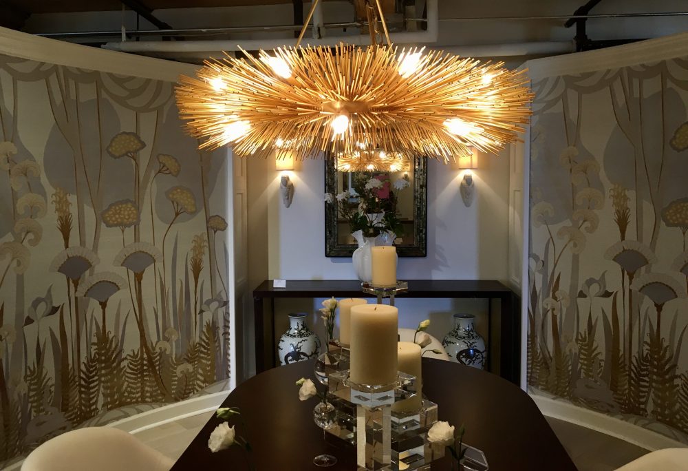 Now, as we have become tired and bored with gray’s unexciting interiors, I am beginning to see a spark of ingenuity. The idea that a touch of gold and copper are gaining popularity. These colors are delightful and add excitement. I see gold presenting itself in touches here and there, in chandeliers, pillows, framing art, sinks, faucets and gold touches on furniture pieces. No longer are we concerned that every single metal in our homes must be brushed nickel, stainless steel or silver metallic. Changing all the doorknobs to brushed nickel hoping to sell your home is behind us. It’s becoming more eclectic and the effect of all these colors working together is more interesting.
 One doesn’t always understand coordinating these variations of metals together. It can be more difficult to do it well. The untrained can easily lose the continuity they were seeking and don’t approach the solution carefully. One still must consider the light fixture above the mirror, the faucet beneath it, and the hardware on the cabinets in the bathroom. These metal materials can look disjointed if they are not coordinated. However, it does not require lockstep coordination in every single metal item in your home. On the contrary, it can make it more interesting to add a touch of gold, bronze, copper, brushed nickel, or chrome to the mix.
Many new trends I see firsthand when I observe them at the International Home Furnishings Market every Spring and Fall. The new products one sees have a great relevance and influence on America’s interiors. Many of these trend setting design ideas are actually introduced in Europe first. As they reach the United States many are edited and analyzed until they have relevance for our American culture and needs.
I see these pieces reflected in new, inspiring accessories, lamps, and furniture. It’s a welcome change. It seems more balanced, and has more serendipity contributing to a more creative, unique design solution. I am excited to see how its influence may grow and add warmth to our home’s interiors. I’m sure we will see more of the precious metal colors as they charm the public and spark our gray worlds.