
Today’s blog is the second in a series about lighting. Many have experienced disappointment in a paint color, and haven’t known why. You may have selected a color you love, only to hate it once it’s on the wall. This may not be completely your fault.
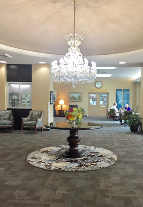
Attractive color and lighting combination
Light affects how we perceive color. Even in a completely dark room, a white wall appears to be black. Now, that seems extreme, but it’s true! Most people do not realize how subtly color can be affected by light.
I am reminded of one of my first residential design projects. The client asked me to select carpet, draperies and a single paint color to be used for both the living room and dining room. The client called, very upset, because the paint color looked fantastic in the living room, but was pink in the dining room!
I raced to her home and was amazed to see that she was right. The afternoon sun in the living room created a nice, warm khaki-colored atmosphere. But when we walked into the dining room, that same paint color was a lovely blush pink. I was apologetic and wondered how the same fabulous color wasn’t as fantastic in the dining room.
After a moment, I noticed the six sconces in the dining room lit with amber colored flame bulbs to cast a romantic glow. This type of lighting was completely different from her living room, lit with table lamps. The source of the problem was obvious when I asked her to remove the amber bulbs and replace them with typical incandescent light bulbs.
No, the dining room color was perfect – it was the amber bulbs that changed how the paint looked. Perhaps if I had spent time studying the room with the amber lighting, I would have chosen a different color for the walls.
This was a lesson learned. Always choose your paint color while you’re looking at samples in that room. Sunlight will influence how color looks, as will reflected light from outside the room. Incandescent bulbs, LED lights or fluorescent light sources will also impact the appearance of paint color.
I always use a piece of white cardboard with a wide strip of the paint I am considering. This is called a drawdown. I study it on the walls of the room I am painting, looking at the color sample on each wall in the room. Especially important is the wall directly opposite the door. This will be your first impression of the room. Using a drawdown helps me eliminate the influence of the existing wall color.
This idea of using light and its source to select paint color works perfectly for exterior colors as well. Just as I do with the interior, I select my color for the exterior considering the surrounding buildings and the light source.
Along with that, I consider the effect of sunlight on the residence as you approach. Most of your guests will arrive during the entertaining hours. Will sunlight be flooding the front of your home? Or will your home be silhouetted against a setting sun? How does your home fit into the neighborhood? Can we select a color that sets it apart but is still cohesive with its surroundings?
As you can see, selecting your paint color can be more complex than first imagined. The right color can make a home warm, dramatic, charming, rustic, or even change its nature completely. Taking the time to study all the influences of light on color is something I love to do.
If you feel that you’re color-impaired and need help to make a tasteful choice, call 402-498-8777 for a consultation. Our specialty is creating relaxing and refreshing spaces.